As a double major in computer science and cognitive science back as an undergraduate, I was fascinated by how even complex concepts might be effectively conveyed to a broad audience, given some understanding of how people think. One of my favorite class readings was an essay called “The Science of Scientific Writing,” which uses features of how people process information to show how simple changes in writing style can dramatically increase reader comprehension. I believe the same framework may be used in other communication channels to add clarity to previously impenetrable muddle.

Making complex topics accessible to broad audiences is no more critical than in the realm of enabling functional democracy. The democratic system, by its nature, requires that ordinary people understand and decide on a mind-bogglingly broad array of highly complex issues like international economics, healthcare infrastructure, legal procedures, and more. Or at least it requires a level of understanding that enables citizens to select the best candidate to decide for them, which in itself may be far from easy. At a moment in history marked by viral misinformation on topics of health, social, and civic import, it is clear our systems for effective public communication have broken down. Undoubtedly social and political factors are involved here, not simply barriers in communication technologies or poorly designed fact sheets. Nevertheless, an effective civic data communication infrastructure remains a necessary, even if not sufficient, component of any transparent and well-functioning democratic system. This infrastructure forms the foundation of an informed citizenry, productive public discourse, and, ultimately, intelligent policy decisions.
In this post I will review research literature and other sources that shed light on some key questions core to this design challenge:
- How do ordinary lay people process data and statistics?
- What are the current constraints and approaches to sharing civic data?
- How do citizens evaluate these current design practices?
- And finally, how might these design practices be improved to facilitate better citizen comprehension of relevant civic information, more data-driven advocacy, and better policy making?
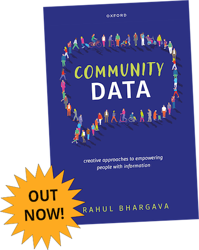
These insights will be used to inform a larger research initiative, undertaken with Professor Rahul Bhargava of the School of Journalism and Media Innovation and the Department of Art + Design at Northeastern University as well as in collaboration with an external community-based organization. We plan to collaboratively prototype a design product aimed at improving on existing tool sets for communicating civic data to citizens of the United States at the local city level.
What we know about how lay people process statistics

To design a relevant information design product, it is vital to understand the perspective of the user. In this case, we are interested in understanding the way that US citizens engage with civic data dashboards and other related communication channels. A high-level trend across much of the research literature is that, unlike researchers, lay people tend to be more highly influenced by cultural, emotional, and personal factors in their engagement and evaluation of data dashboards. A study by Yuo Luo and Jiaying Zhao of the University of British Columbia, for example, noted that lay people can look at exactly the same data and have completely different conclusions based on their prior personal and/or culturally biased beliefs (“How to engage different audiences with the same graph?”). In fact, those with different prior beliefs actually focused visual attention on different parts of the same graphical chart.
Similarly, in a webinar reviewing multiple recent research findings related to public interpretation of civic data related to COVID-19 risk, researchers found that emotional and cultural influences highly impacted citizens’ perception of risk level given the same information, leading to widely different levels of compliance with public health guidelines (EPI-WIN webinar: “Influencing Risk Perceptions about COVID-19”). Citizens were also influenced by social factors such as the existing level of trust within their community. Without baseline levels of trust between citizens and their governments - whether local, state, or national, impactful engagement with community metrics was very challenging.
Interestingly, the particular format of how data is conveyed can significantly impact its persuasiveness for a lay person. Moreover, how exactly this plays out depends on whether they have strong prior beliefs about the topic in question. In a study evaluating the persuasiveness of different types of data visualizations on various controversial topics, viewers already biased in favor of key conclusions of presented data found that graph representations - rather than data tables - were more persuasive. Those biased against the conclusions presented, however, found that numerical tables were more persuasive than graphs (“The Persuasive Power of Data Visualization”).
Another study highlighted relevance to personal life experience as a factor. In this study, researchers at Bucknell University interviewed citizens of rural Pennsylvania about their preferences for and interpretation of various civic data visualizations. Their finding was that these residents preferred and engaged most with those whose topics were most relevant to the viewer’s personal experience and situation. They also preferred simplicity and attractiveness in visualizations (“Data is Personal: Attitudes and Perceptions of Data Visualization in Rural Pennsylvania”).
This preference for simplicity and usability was true also in a study on civic dashboards in Dublin in which residents said they gravitated toward and preferred visualizations that were simple, structured, usable, attractive, accurate, and which had personal relevance (“Creating design guidelines for building city dashboards from a user’s perspectives”).
Overall, the research literature indicates that personal and emotional factors, existing trust levels, and other contextual factors must be taken into account in the design of any public-facing data interface, as well as a sensitivity toward usability, relevance, and visual appeal.
Current constraints and practices in conveying civic data to the public
Existing data dashboard design practices by governments and nonprofits are constrained by legal guidelines, lack of resources, and challenges in coordinating among many organizational stakeholders (“Bringing Clarity to Transparency: A Study of Dashboard Implementation in the Public Sector”). Unfortunately, these constraints can lead to questionable data quality, incorrect data interpretation, bad analysis, manipulation of data in various ways that support a predefined view, and lack of the engagement needed to create impact. For example, researchers at Delft University of Technology highlighted these challenges and noted that dashboards, if not implemented correctly or supported by baseline levels of trust among the community, created the risk of even less transparency and trust (“Data science empowering the public: Data Driven dashboards for transparent and accountable decision making in smart cities”). They also noted that civic dashboards needed to be complemented by mechanisms for supporting appropriate data interpretation and effective citizen engagement.
Numerous research case studies also indicate the prevalence of lack of standardization, variability in adherence to accessibility standards, assumed knowledge of specialized systems (e.g., GIS), and challenging usability (“Use of Dashboards in Government: Fostering Transparency and Democracy Series”). Overall, **governments and nonprofits face organizational, resource, and coordination challenges, which often result in lower usability, data quality, and fewer support systems for facilitating effective engagement. **
How we might improve

Condensing and conveying such potentially disparate economic, health, social or other information in a form intuitive and appealing to engaged members of the US public with varying levels of analytical background is not an easy task. Nevertheless, insights from case study research reveal that user-centered design practices, prioritization of practical relevance, and compliance to best practices in usability can produce valuable results. For example, a case study documenting the user-centered creation of a data tracking tool for policymaker accountability details how a focus on data related to policy maker promises empowered citizens to better evaluate their elected representatives (“Promise Tracker and Monitorial Citizenship” (blog post)).
In another case study, University of Salerno and University of Campania Luigi Vanvitelli created SPOD, a Social Platform for Open Data, which enabled users to access, manipulate, and share open data while engaging in data-driven discussion about issues related to their local communities (“Engaging Citizens with a Social Platform for Open Data” (conference ppr)). This custom tailored solution additionally engaged citizens in open data sharing platforms by combining these with functions for forums and interactive discussion. This helped actively engage more citizens in exploiting open data, while facilitating more effective, data-centric discussion in a way not well supported on traditional social media platforms. Here the authors additionally leveraged the phenomenon of “Web 2.0,” or an internet built on distributed, user-generated content and interaction, that has redefined the concept of “active” media consumers “Active Audiences” (paper). Data dashboards may do well to empower citizens to engage among their peers to make the dashboard experience more dynamic, relevant, and engaging. This solution demonstrated a case study in the newest chapter in the evolution of citizen monitoring.
Key Takeaways
In summary, citizen lay people constitute a unique class of users of data communication products. These users are highly influenced by personal, emotional, social, and contextual factors and generally prioritize simplicity, usability, accuracy, and personal relevance. Unfortunately, historical and organizational constraints among government and non-profit providers of current data dashboards frequently cause questionable data quality, incorrect data interpretation, bad analysis, manipulation of data in various ways to support a predefined view, and lack of the engagement needed to create impact. Nevertheless, recent case studies demonstrate that improved and even engagingly interactive solutions are possible given practices in user-centered design, prioritization of practical relevance, and compliance to best practices in usability standards.
These insights will help inform my approach in my broader research initiative to prototype a design product that improves on these existing toolsets in several ways:
- First, this design product will build on best practices in participatory design and user-centered research. Creating a dashboard that presents exactly the right data in the way most valuable and relevant to our users - engaged citizens - is critical. This process will result in a data dashboard that supports our users and external organizational collaborator’s specific, custom goals. Additionally, a scalable approach would be ideal to maximize impact and accessibility among many users.
- Second, I will opt to target my solution at the local city level. This is because local communities, unlike (quite frequently) national communities, can often display the baseline levels of trust between citizens and government often required to engage in any productive way with data. Also, taking initiative in protecting citizens at the local level has perhaps never been more important than at this very moment. This niche additionally aligns with my own research interests.
- Third, it will be designed for optimal simplicity and usability. Intuitiveness of a dashboard, specifically to American laypeople with varying levels of analytical background, is critical. Existing research demonstrates this as a critical factor in citizen value.
- Finally, the design product should look attractive and engaging. Generating interest and engagement is a key goal of this initiative and a substantive factor in user experience.
- To promote trust of relevant insights, I also hope to focus on high quality data sources that are additionally perceived by the public as most credible, de facto, and incontrovertible. If possible, it would be great to at least explore an embedded interactive component to the product, such as a forum capability, to make it more engaging and as an ongoing temperature check of the relevance of the data to the needs of users.
In closing, designing effective, engaging design solutions to promote an informed citizenry is an important task. Although doing so presents unique challenges - both from idiosyncrasies in how lay people process information and via organizational and regulatory constraints - approaches that incorporate user centered-design, prioritization of practical relevance and compliance with best practices in usability standards can result in valuable products. I plan to implement these strategies in my impending research initiative to improve on existing civic dashboard infrastructure.
Interested students, researchers, organizations, or collaborators would like to become involved with our project can reach out to bullister.d@northeastern.edu.