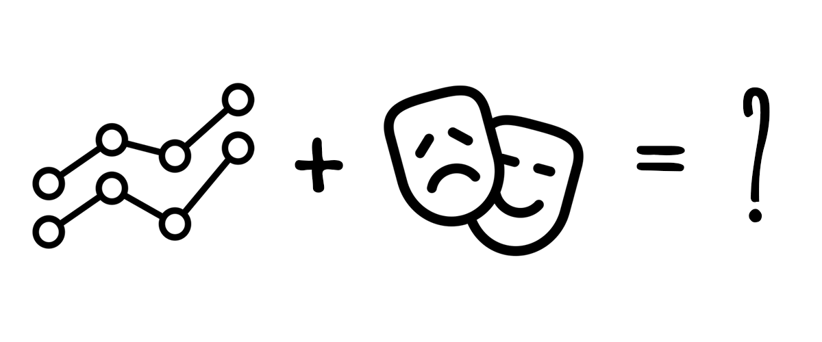
Since the conclusion of the research phase and our last blog post, our team has been iterating on a series of activities revolving around our continued central goal: How can we create theatre-based experiences that bring people together around data in social contexts, in order to build empowerment, challenge power structures, and build capacity to speak the new language of data? In interviews with two experts in the theatre-based methodologies we studied, as well as two prototype workshops, we are moving closer towards bringing our activity design outside of our university community. This blog post is an overview of the activities we are designing, what we have learned from trying them out, and how this has shaped our thinking as we move forward. We’ve found three key takeaways from this work that we plan to dig into more:
- Our theatre-based invitations to explore data help participants overcome barriers to “math thinking”
- Embodying the data changes how participants reflect on the real people represented by the numbers and quotes.
- Activating pathways of muscle-driven memory may change what sticks with participants in the longer term.
What Does a Data Theatre Activity Look Like?
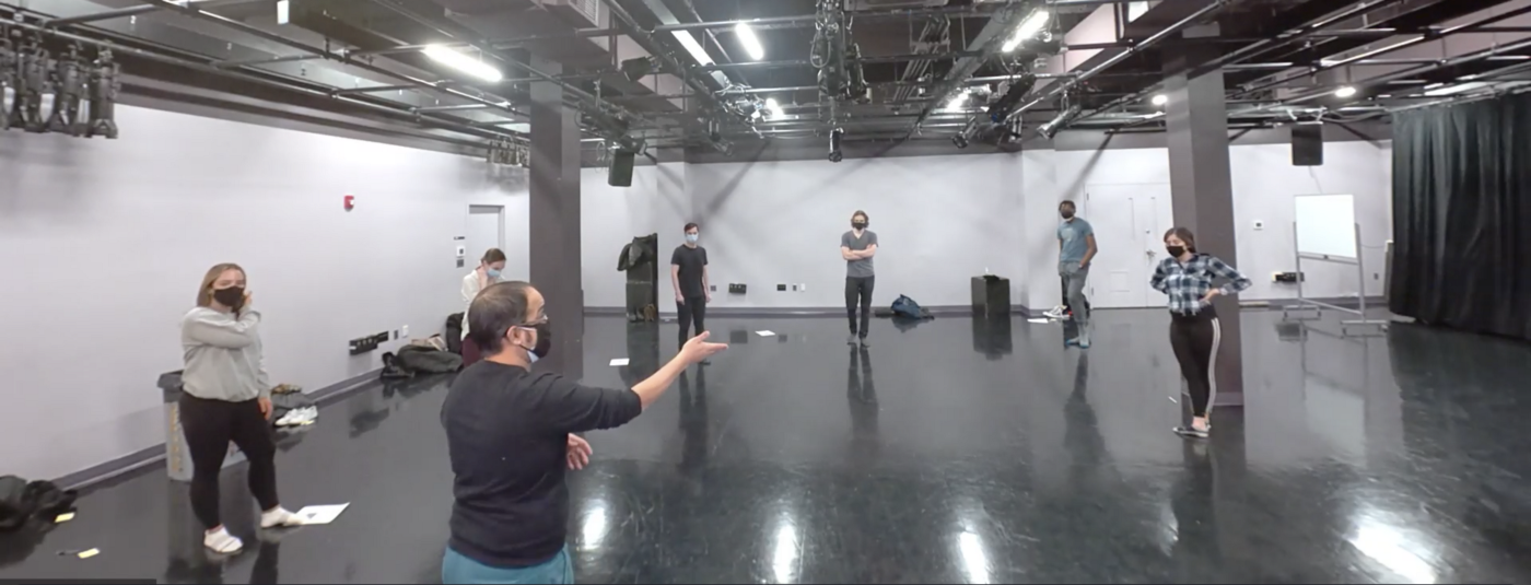
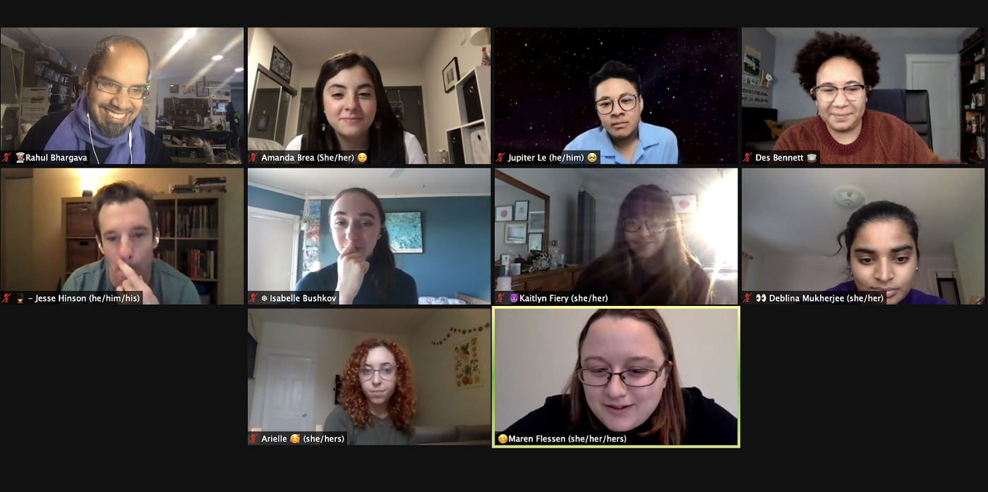
Activity design is no easy task. Creating a playful setting that invites people into a theatrical performance centered around data is our driving challenge. We’ve run two prototype workshops within the Northeastern University theatre community, one virtual and one in person. Both tested out the two activities we have designed.
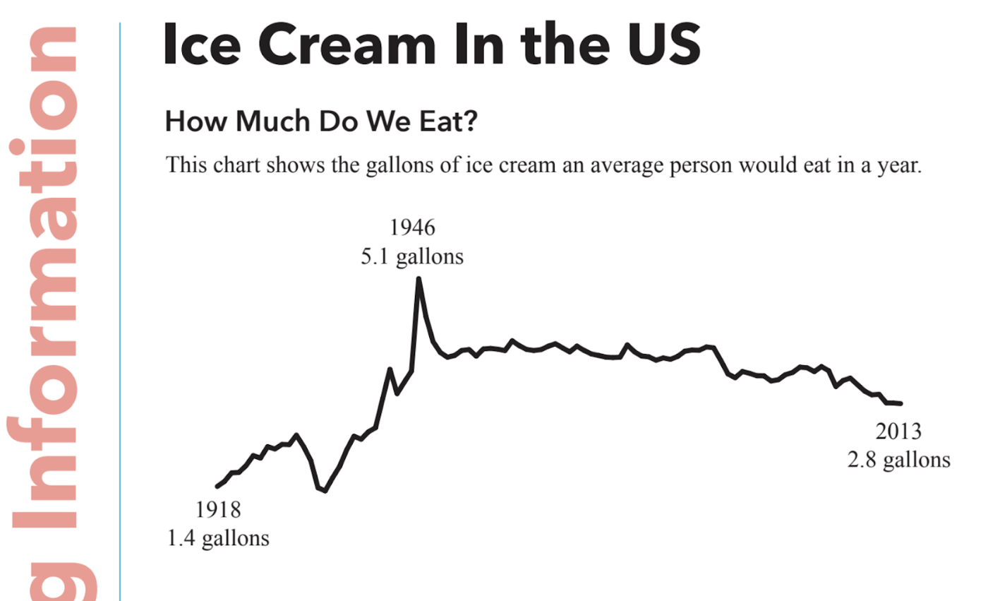
Each began with a fun activity to establish a playful atmosphere―such as the classic “wave” or a “living machine,” where participants collectively contribute signature sounds and movements in succession. These warm-ups established a safe space for play, which was imperative in disengaging any fear or anxiety triggered by the concept of “data.” Once the warm-up activity was over, we introduced our first data set―a handout with two graphs related to ice cream consumption. This lighthearted topic was our method of scaffolding our first use of traditional data representations (a line graph and a bar graph), in the context of a familiar and comfortable topic. Talking about ice cream encouraged participants to merge their creative inclinations with their “math” brain for the first time in the workshop, drawing upon the playful tone of the warm-up. Each group had about 10 minutes to review and reflect on one of the two graphs― a line graph representing ice cream consumption over the century, and a bar chart representing flavor preferences. Participants were instructed to choreograph the entire group in a movement piece, either representing a trend they saw, or embodying a reaction they had to a data point. This activity was followed by a reflection period, where participants could give feedback on how comfortable/uncomfortable they felt with the activity, or any observations they made in watching others. We also asked participants what they learned or took from this activity, and what benefits were yielded by this new perspective of data embodiment.
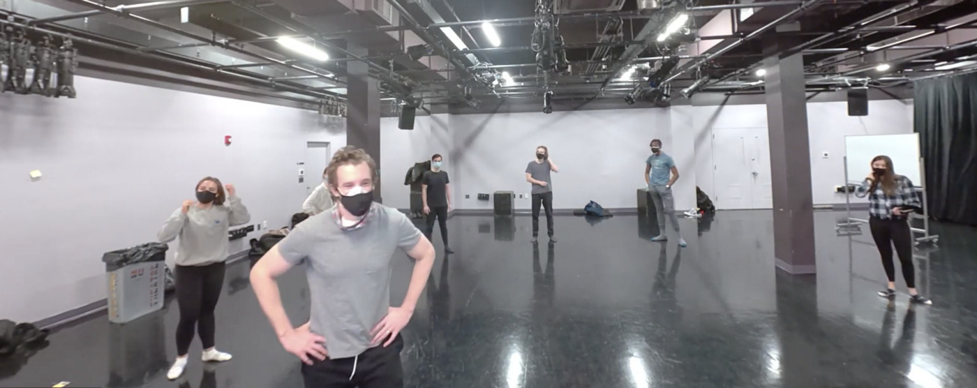
The second activity encompassed a more serious set of data that potentially personally affected some participants. We distributed two handouts related to food insecurity―by culture, by location in MA, etc. We gave groups more time to reflect on these handouts, and find something to respond to. Instead of having each team choreograph the group, participants created their own short performances related to a data point of any size from the handouts. We left the activity open-ended, allowing participants to choose anything from either handout and incorporate any number of elements―dialogue, movement, props, etc. The reflection piece for this activity focused on the transition to more serious data points, and how participants felt embodying something that is so deeply personal to many in the community.
Outcomes of our Prototype workshops
We’ve learned a ton from these two workshops, and have already begun to iterate on our activity designs. Even though both workshops were within the theatre community at Northeastern University, one was in-person and one was virtual. In the Zoom workshop, participants jumped into the warm-up right away, taking full advantage of their personal space. This high-energy atmosphere carried into the first activity―where the responses to the ice cream data prompted a wide variety of creative interpretations and responses. By using the “host view” feature on Zoom, participants were able to choreograph the team virtually in various sculptures, and play around with the geography of Zoom boxes and positioning. However, when we arrived at the food insecurity data, the Zoom participants seemed to pull away, not willing to make the jump into more solemn subject matter. They were cautious in questioning the assumptions made by the data surrounding cultural and geographical trends of food insecurity, and lost the experimental spark that dominated during the ice cream activity. Unlike the first activity, participants were assigned a specific graph or chart to look at―and “skated across the surface” in dealing with these difficult topics. The elements of props and movement were more sparse―many stayed put in front of their cameras when it was their chance to perform.
This contrasted with the second, in-person, workshop, which took place within an acting class. The warm-up in this scenario felt less impromptu and more ritualistic, and the intense focus of the participants alluded to the academic backdrop in which we worked. Accordingly, the first ice cream activity yielded polar opposite results- students were given free rein to choose what data point(s) they wanted to choreograph, and every group narrowed in on the same graph. Many of the presentations felt repetitive in nature, and the playfulness from the first workshop was transformed into something presentational. The second activity also yielded opposite results―when handed a more difficult, somber subject matter―and given free rein to choose―participants developed mini skits, and used the space in a dynamic way. We found it fascinating that two workshops utilizing the same subject matter, within the same community of people, yielded such different results in these two settings.
Overcoming Barriers to “Math” Thinking
Our theatre-based invitations to explore data helped participants bridge between traditional delineations of thought — math vs creative, left vs, right brain, etc. In the second workshop, we asked in the warm-up what comes to mind when hearing the word “data” for the first time. Responses included “information”, “numbers”, “technology”, “cold”, “hard”, “analytical”, and more. These traditional associations are rooted in the way we are educated — we are too often taught that you are either a “math” person or an “art” person. Traditional two-dimensional representations of data reflect these fundamental distinctions. In math, we are taught there is a right and wrong. Yet in the human experience, nothing is ever truly right or wrong or black and white. In its traditional formats, data is accepted as cold, hard, proof, and its certainty and authority is rarely questioned. Yet many times, data in the realm of topics such as food insecurity often only shows a narrow perspective, which could potentially perpetuate assumptions about certain groups and communities. We found that people were much more willing to interrogate and question data when asked to physically embody it, in contrast with looking strictly at two-dimensional representations.
The experience of living the data from this angle was new to them, but participants showed enthusiasm in their first encounters with blurring these traditionally steadfast barriers. One participant noted, “You are translating your math mind into a creative mind, into a story mind, into a people mind.” This process of translation may not be comfortable or easy, but it is very worthwhile. Another participant echoed that “(We were) looking at a piece of data and the numbers and quantitative stuff, but what’s the story here. I thought that was really fun.” And while one participant noted that “I was really self-conscious about being critical of the data set,” the group agreed with the sentiment that “I think that is part of finding the stories, you have to translate.” The benefits of moving away from traditional boundaries of “math” and “creative” thinking allowed the data sets to come alive in new ways, and leave participants with a broader understanding of the numbers and of themselves.
Rehumanization ― Representing Real People
In working with data such as food insecurity, which affects many college students on a personal level, it is easy to generalize experiences when looking at two-dimensional graphs and charts. Yet the numbers and statistics surrounding food insecurity aren’t just numbers― they represent real people, with real experiences and struggles. We are finding that theatrical embodiments of these data points rehumanize the data, by allowing participants to consider their own experiences and knowledge of food insecurity, and exposing implicit biases present in the narrow snapshot of a graph or chart. Consider the way a photo may show a snapshot of an event, such as a day at the beach, but does not expose the whole experience― the sweltering heat, the crying baby, the seagulls diving for your food. Participants reflected that the second activity “Grounded it in the actual people.” and “got me thinking about the people behind the data, behind the numbers.” They were “telling the story of the people behind the data.” By asking participants to think about this data in new ways, we are essentially teaching around the data — forcing them to expand their perspective and see the bigger picture. Rehumanizing the stories behind the data and empathizing with the human experience is much more impactful than associating lived experiences with only numbers. Participants acknowledged that “Statistics and data sometimes generalize experiences and are not telling the whole story just by looking at the numbers.” and “Using reflection and performance shows the story underneath it that the data attempts to bury.” In working with community groups that are directly reflected in these data sets, we would also invite them to take control over their stories.
“Datasets represent a scientific, one-dimensional perspective of an issue. This allows communities to redefine what is ‘a hard tangible fact’ with emotions.”
Muscle Memory vs Mental Memory
Another topic that emerged in conversation was the value of different capacities of memory within our nature, which have typically been compartmentalized in their functionality. While mental memory is associated with academics and the classroom, reading text or preparing for exams, muscle memory is reserved for sports or the arts, where techniques develop with significant training, repetition, and patience. When inviting participants to overcome barriers to traditional “math” and “art” brain distinctions, we also encouraged the mix of two different forms of retention― each with significantly different outcomes.
Participants noted that muscle memory is more visceral, involving more of your body than just your head. Data in these activities is experienced not only in mental assumptions and associations, but in movement, distance, and sound. The experience of muscle memory allows a deeper and more holistic experience of data in many parts of your body, as would the impact of kicking a soccer ball in an emotional game-winning goal. However, the downside of muscle memory is that it is fleeting―it can be ingrained with repetition, but the experience is never the same thing twice in a row. In essence, it is ephemeral―and your perspective on the experiences changes over time.
Mental memory is more permanent in nature―the things you learn are cataloged in textbooks, graphs, and charts. Relearning information won’t change the factual elements― it is often represented on paper, forever memorialized and unchanging. Yet this longer-lasting form of retention involves only the head, and doesn’t reflect a deeper physical commitment to the experience of knowledge. One participant made an analogy of looking through the window of the house, vs, being inside. Your perspective on information is much different when you are not physically interacting inside this house. We challenged participants to consider: is there a world where we use both? Where one informs the other, and interacts in a constant dialogue? Often we look at charts or graphs, or visual representations of things changing over time in relation to one another, and physicality may make it resonate better. Yet the subconscious part of the mind (frontal lobes) was not as engaged during physical movement as when analyzing numbers on a page. It is worthwhile to continue to explore crossing these boundaries, or considering them fluid. The untapped potential of combining mental and muscle memory is evident, and is beginning to emerge from this work.
What’s Next
After debriefing on each of these workshops, we are in conversations about how these activities would translate outside the theatre community, and how we can bridge the gap between data and our theatrical toolkit in a more gradual manner. We discussed incorporating more “scaffolding” between the two activities, whether it be a longer period of reflection between each, or incorporating a group discussion between the time the participants review the data and when they are tasked with choreographing or creating responsive pieces. We also are looking for new ways to set the playful warm-up tone intentionally, such as a physical or mental challenge that requires collaboration. Incorporating more structure in terms of assigning data points or charts to groups of participants, and relaying potential theatrical elements that may be useful, are other options we considered in moving this work to a wider audience. Our next big step is to work with community groups once the burden of COVID implications is lessened. Until then, I will be writing another blog post to summarize our findings from our expert interviews, and considering methods to implement this work in communities that are directly affected by the data sets we are utilizing. We would love to collaborate with anyone who sees the value of this work, and has ideas or insights into how to bridge the gap in our community work. If you are interested in collaborating or have any questions or ideas, please drop us a line!