The hype around data continues unabated, with the processes of quantitative analysis seeping into more and more of our lives. From government policies, to business decision making, quantitative data have become central to a growing part of people’s lives. We are presented daily with charts, graphs, maps, infographics, tables, and more. Despite this increase in use of data, our toolbox for interacting with data is far too constrained! Charts and graphs aren’t always the best approach for telling a story or engaging a group of people around data. My work over the last 10 years of running data literacy workshops has been focused on building a better toolbox, one designed around context of use, appropriateness of representational encodings, and respectful of the people and processes data represents. Over the last few years in the broader field I’ve noticed a growing trend pushing in the same direction. People are increasing exploring sound, space, feel, shape, and more while they design data stories! Perhaps it is hyperbole, but I think in reflection last year is shaping up to be the year that physical data visualization in particular exploded as a new norm. Politicians, communities, activists, and artists across the US built data sculptures to tell the year’s most important stories. Read on for some examples that demonstrate why I think 2020 was the year of the data sculpture.
Big and Little Data About the Pandemic
The year of the global COVID-19 pandemic reshaped our world in many ways, including putting health data at the center of daily lives. Updates with charts and numbers were suddenly coming at us every day via tv, social media, and emails. A message about changing a line chart, “flatten the curve”, become a household phrase! These numbers, and the charts representing them, helped guide us as we tried to understand the scope and risk of the pandemic. Note that data visualizations were used by public health experts and conspiracy theorists alike; this isn’t a practice reserved for use by “official” sources. However, people in the public service used data at a pace seldom seen before in their industry. I want to highlight Gov. Cuomo’s use of the covid “mountain” model as one example of data sculptures making their way into the popular vernacular.
 Gov. Cuomo in front of Mt. COVID. Watch his short talk-through.
First, let me offer some background. Through early spring of 2020 in the US it was abundantly clear that the federal response to the pandemic was woefully (and willfully) negligent. President Trump’s briefings were becoming more and more crazed, so America by and large checked into another source - Gov. Cuomo’s briefings abut the outbreak in New York State. Many responded well to his fact-based, data-driven updates. By his June briefing, which included the “covid mountain”, New York had turned the corner and was effectively “flattening the curve”.
Let me be clear: I’m not arguing that this is a good data sculpture. He unveiled an object that looks like a museum model of a landscape, probably carved out of foam, covered, and painted. The horizontal axis, left to right, encoded time since the first infection in New York. The vertical axis represented the amount of cases per day. There was a little “42” annotation stuck on top that marked the peak infection rate. Honestly I don’t think the 3rd dimension, coming forward, encoded any data at all… it just makes it look more like a mountain in service of his metaphor. This is a prop used to tell a story about New York locking down and getting the infection rate under control. Let that sink in - one of the top public officials looked too during the spring peak of the pandemic used a data sculpture to explain what success looked like. Gov. Cuomo’s central storytelling device? The narrative metaphor of “climbing a mountain.” I don’t even think that is a good metaphor. The sculpture was met with derision on social media, widely panned for looking like a science fair project.
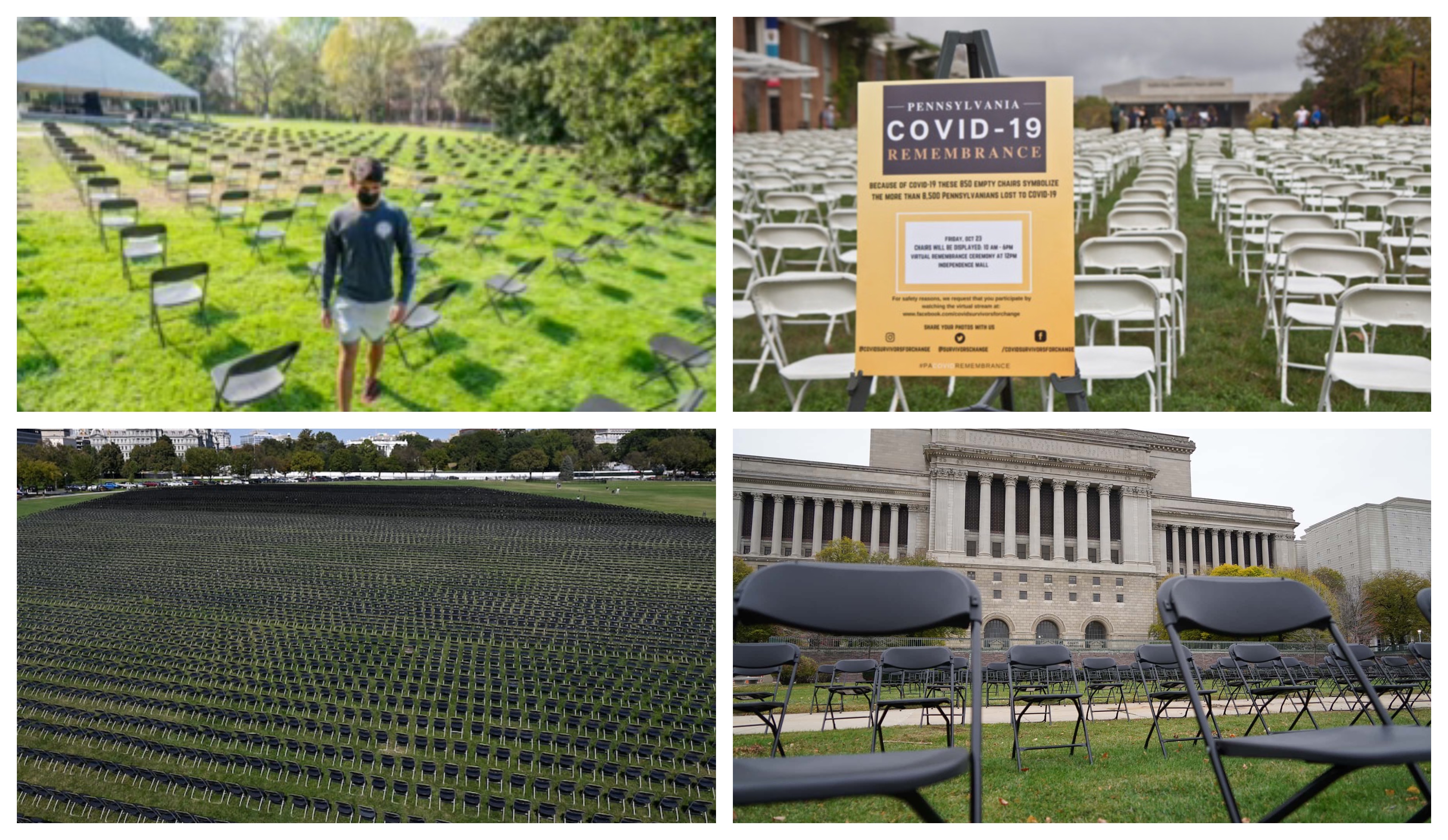
 A few of the COVID-19 memorials that sprung up on town greens across the US during 2020.
On a more human scale, the loss of lives in many communities across the US has been immense. During the summer of 2020 a popular memorial idea sprung up and spread - the idea of setting up empty chairs to represent the numbers of lives lost. From Nashville, to Milwaukee, to Philadelphia, to the White House, these makeshift memorials are physical data sculptures that literally represent the brothers, sisters, mothers, fathers, and more lost to the pandemic. This idea is simple, understandable, and heart-breaking all while respecting that the data represents actual people. It effectively embraces the loss and attempts to provide some spectacle of the collective grieving process.
Taking City Budgets to the Street
The Defund the Police movement in the US emerged as an actionable agenda from the summer of peaceful protests in opposition to structural racism in the US. In particular, the movement argued that local funds were overspent on supporting a violent armed police force rather than being distributed to social services that serve as protective factors against crime and violence. Arguments over the phrase itself sometimes eclipsed the concrete and actionable suggestion that the vast majority of 911 calls could be diverted to non-armed responders. Activists began deep dives into budgets all over the US, comparing funding rates for police against those of social services, arts, libraries, and more. In general the results provided strong evidence that reallocating police funds would improve public safety.
Here’s the problem - budgets are boring. People understand that money matters, and that budgets represent priorities, but oh my goodness in my experience nothing puts people to sleep faster than a set of bar charts showing budget allocations at a community meeting! This movement wasn’t happening in meetings. This movement was happening on the streets, where peaceful protests were met by a wave of violent police response.
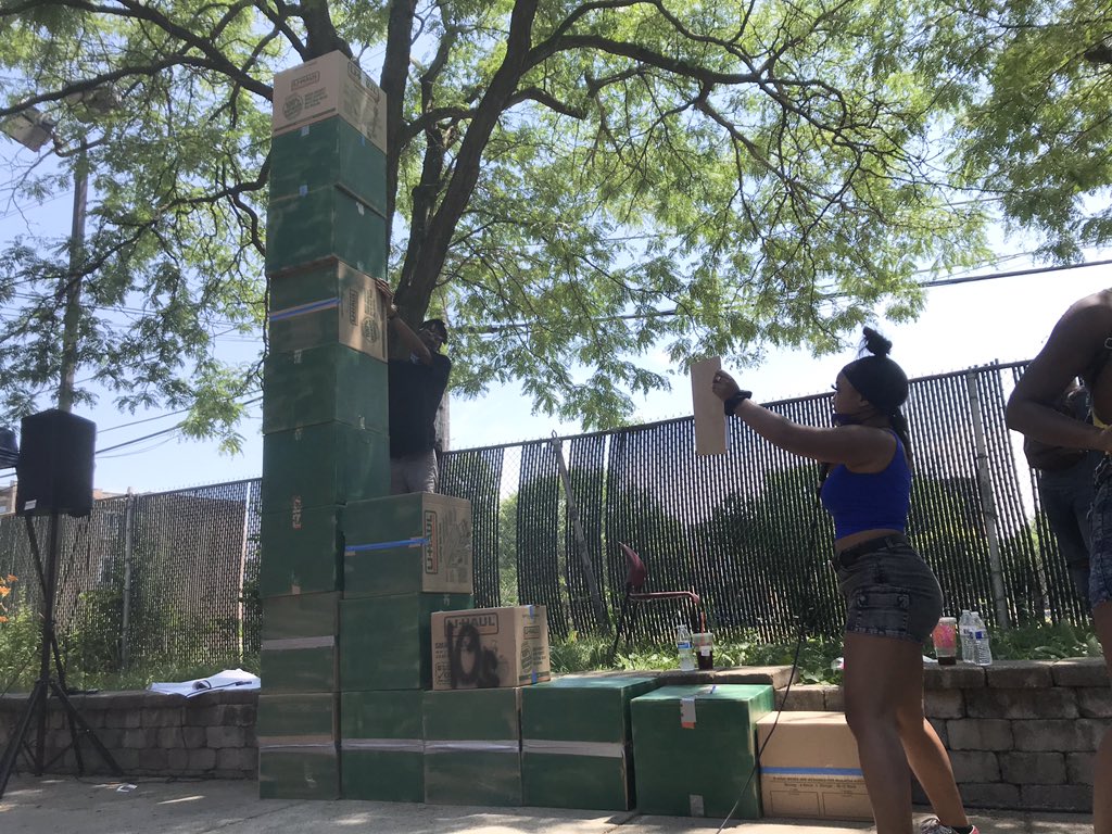
 A cardboard 3D bar chart showing Chicago’s budget allocations. Source: #ashapoesis on Twitter
Chicago activist Asha Ransby-Spron, along with other young organizers at BYP1000, tackled this head on by created a physical bar chart to show budget allocations out of stacked and painted cardboard boxes. In Asha’s words: “These boxes visualize Chicago’s city budget. The tall stack is the $1.8 billion police budget. Housing & public health each only have one box. “ This bar chart, brought to life with the spectacle of street art, provokes reflection and conversation. You simply can’t ignore it a giant chart made out of cardboard boxes towering over you. More importantly, I’ve written previously about how research has shown that this type of “informal” visualization is more likely to motive questions and conversation than a formal chart. These activists are inviting people into the debate with this type of street chart.
Understanding Climate Risk
Globally, data-driven planning processes are fully baked into strategies at large non-profits to address topics like climate risk and crisis response. This is complex data, covers a complex topic, has very inconsistent completeness, and has loads of uncertainty associated with it - basically the hardest combination of problems to face when visualizing data! My colleague and collaborator Pablo Suarez has been using a physical, arts inspired, approach to bringing people together around this data to drive planning and decision making in support of climate resiliency.
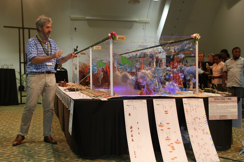
 Pablo explaining his Risk & Time data sculpture. Source: World Bank blog
One example is his Risk & Time piece, presented at the 2019 Pacific Catastrophe Risk Assessment and Financing Initiative forum (I know it’s a mouthful, but that’s just how international agencies name things). Yes, technically that piece is from 2019 and this blog post is about 2020 as the year but I hope you’ll give me some leeway here. His data sculpture showcased a timeline of environmental measures, extreme weather events, impacts on people, and economic outcomes. Importantly, Pablo worked with local artists from Vanuatu who used indigenous materials and techniques to make symbolic representations of the events placed within the piece. This evocative piece invited you into a timeline of these climate change fueled disasters, provoking a different sort of conversation about climate resiliency and the international response to these growing risks. The objects and their hand-crafted feel put viewers in a different staet of mind when engaging with the data. This arts approach effectively showcasing considering the material and makeup of data representation.
So What’s Next?
Why the surge in data sculptures? I think we’re collectively realizing that as our society becomes more “datafied” we need to get better at two things. First, data presentations need to meet people where they are in regards to data literacy and visual literacy. Second, using a more creative toolbox for presenting and sharing data invites more people to join into data-driven processes.
These points are especially important when considering questions of access, power, and efficacy:
- Access: Who can access data when it is locked in a online spreadsheet? Who can’t access it in that form?
- Power: Who gets to decide what data is collected, and who it is collected from and about? Who owns the data?
- Efficacy: Who believe they can make change with data? What forms of the data are accepted and validated as legitimate?
You can probably tell where I’m going here… we can increase access, democratize power, and build efficacy by embracing a more creative toolbox of data storytelling techniques like data the sculptures I shared above.
That said, data sculptures can do more if we can move beyond just remaking charts in 3D. Building out of materials that match the message, and supporting more than just the initial 5-second wow factor, are two approaches that I’d love to see more of (a point I’ve expanded on before). There is power in the simplicity of the examples here - people just understand them very quickly. I won’t argue that building a clear and understandable data sculpture is inferior to building an overly clever one. Still, I think there is more opportunity here. A cardboard chart surprises and delights, but when they come over and talk to you about it how can you build on that descriptive technique with the further data you want to show them? Touch and feel are underestimated and underused here. Physical cues and muscle memory work differently than visual perception. My colleague Dietmar Offenhuber has pointed at a study which demonstrates that physical interactions with objects are held in our long term memory in detailed and robust ways. We just engage with physical things differently.
I hope I’ve proven my case, that 2020 was the year data sculptures broke out of scattered use in art and academic projects and into the mainstream. I think their popularity will continue to grow. This should serve as a reminder that our toolbox for data storytelling is far bigger than traditional chart and graphs. Sculptures, murals, sonification, participatory experiences - these are all approaches that meet people where they are and engage them with and around some data. So the next time you’re telling a data story, remember to look beyond the bar chart.


