IEEE Vis is the premiere global academic computation-focused visualization conference. Each year about a thousand people attend, presenting around 100 papers. Some of those touch on data visualization and storytelling in journalism settings, bringing deep technical thinking and research into a domain that connects to the practicing newsroom. In this post I thought I’d summarize a few selected papers I saw at IEEE Vis 2024 that might be relevant to data visualization experts and data storytellers who work in journalism.
 Structural influce model from Fu & Stasko, 2024
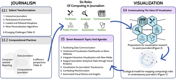
In “More Than Data Stories: Broadening the Role of Visualization in Contemporary Journalism”, Yu Fu and John Stasko identify ways data visualization can expand its impact in journalism beyond storytelling. They helpfullly lay out a research agenda to push other academics to work at this intersection. It might be useful to data journalists to look at their list of newsroom values data visualization can support, and offer some language for working with academics (like me) to develop co-created research projects.
 An example Brazilian news data visualization Brito & Ferreira, 2024
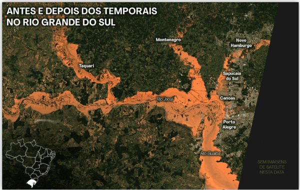
In “Visual and Data Journalism as Tools for Fighting Climate Change” authors Emily Brito and Nivan Ferreira use media coverage of the terrible floods in Rio Grande do Sul (Brazil) as a case study in how data journalism can be a tool for fighting disinformation and climate change. Key elements they focus on include pursuasive communication, risk communication, and challenges realted to literacy and misinformation. Their paper offers valuable insights and examples for data journalists working on climate catastrophes.
 A visual representation of the protocol used in the study by Rogha et al, 2024
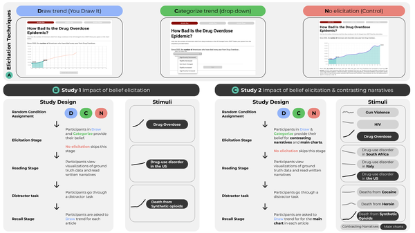
In “The Impact of Elicitation and Contrasting Narratives on Engagement, Recall and Attitude Change with News Articles Containing Data Visualization” authors Milad Rogha , Subham Sah, Alireza Karduni, Douglas Markant, and Wenwen Dou explore the “you draw it” approach to interactive data storytelling. They experimentally explored the impacts of asking readeres for their opinions on attitude change, recall and overall engagement. They found that while showing showing contrasting visual data narratives did increase engagement, they didn’t improve recall nor change attitudes more. This kind of experimental research is critical to understanding how to build more effective data visuals to engage and impact the public.
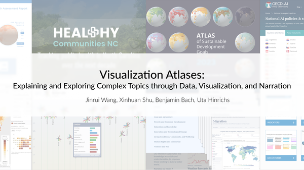 Intro slide about Wang et al, 2024
The paper “Visualization Atlases: Explaining and Exploring Complex Topics through Data, Visualization, and Narration”, by Jinrui Wang, Xinhuan Shu, Benjamin Bach, and Uta Hinrichs, offers a taxonomy of “atlases” of data. This might be particularly useful to data journalists creating exploratory interfaces that let the reader browse through large datasets related to (more explanatory) stories. They found that atlases tend to combine data, narration, and structured navigation to make complex topics accessible. Speficially, many use design templates and careful data curation for consistency and clarity in visual storytelling. Their catalog of these templates and approaches in the paper might help others who are launching projects that create atlases like they describe.
I’m sure there were others that have relevant findings for folks working with visualizaton in newsrooms, but these were the ones that jumped out to me.