As protests against the Trump administration spread, journalists are covering local rallies — but putting them in context of larger movements can be a challenge. To help, I built a simple tool that lets you search for recent protests near you and create an embeddable map you can use in your reporting. Try out Protest Mapper.
A map of the more than 400 protests in eastern Massachusetts since the start of the year.
Media Attention to Protests
One of the responses to the nationwide April 5 “Hands Off” and May 1 Mayday rallies was shock at the perceived lack of coverage from mass media outlets. Critics pointed to a lack of both print and digital coverage, arguing that it didn’t reflect the sheer volume of people that came out on the streets.
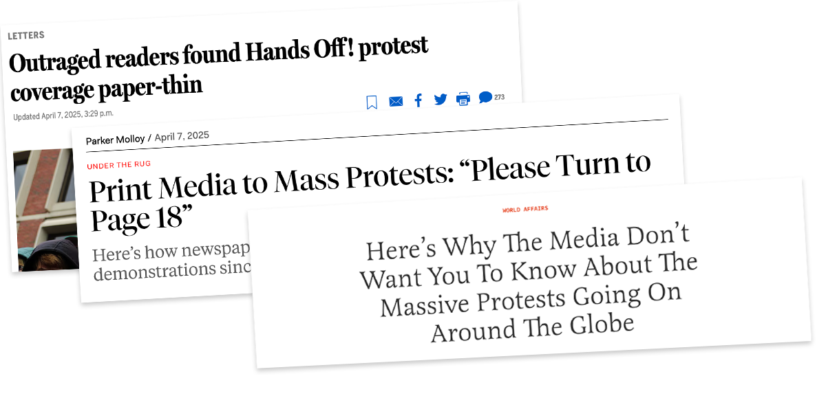 A sample of headlines critiquing media coverage of the April 5 “Hands Off” protests.
At the same time, local and regional media did show a noticeable bump in coverage. A query for articles mentioning both “hands off” and “protest” in the Media Cloud online news archive shows almost 400 matching stories on the 5th.
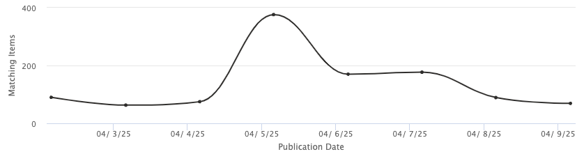 A Media Cloud query for “‘hands off’ AND ‘protest’” shows a peak of coverage in state and local papers on April 5.
Yet it appears that local reporters are covering protests in their area, but not often connecting them to larger movements. That might be because coalitions like #50501 aren’t as well known as unions and long-standing activist groups; they don’t have communications people with long-standing relationships to journalists.
Finding & Evaluating a Public Protest Dataset
One approach to help reporters make those links for readers, and put individual events in a broader context, is to use data about local protests. Connecting this weekend’s rally to events over the last few weeks might connect dots for audiences that are seeing public displays of resistance. I wondered if I could quickly map protests in my area based on existing data sources.
I first reviewed existing data sources to see what was available. A quick summary of what I found:
- The GDELT project appears to have massive scope and has a “Protests” event category, but I found it too hard to access and use, with many broken links and inconsistent information.
- The Carnegie Protest Tracker seems to focus on broad movements, not individual events.
- LiveUaMap seems well established, with lots of social media results, but I found the interface challenging to use and they charge for access.
- Amnesty International’s Protest Map focuses on police violence in response.
- ACLED (Armed Conflict Location & Event Data) appears to be a well staffed non-profit that makes data easily available, updated once a week.
- The Harvard Ash Center Crowd Counting Consortium (CCC) appears to be an academic project that is updated once a month.
This led me to focus on ACLED and CCC, since they are both regularly updated and easily accessible/usable. Each includes a list of protests and related manually curated metadata. They include protests about any topic.
My next goal was to evaluate these datasets. One metric that came to mind was to search for media coverage about protests in a fixed place and time, and then to compare that to the datasets at hand. I decided on Massachusetts in February, a context I know well, and pulled datasets from both Media Cloud and ACLED. To find media stories I queried Media Cloud for relevant anti-Trump/Musk protests with this query:
article_title:(
(protest* OR rally OR strike OR boycott OR walkout OR demonstrat* OR vigil)
AND
(Musk OR Trump OR Tesla OR closure OR federal OR university OR Israel OR Palestine OR cuts OR speech OR student OR research OR congress OR ICE OR agency OR USAID OR NOAA OR NSF OR NIH)
) and language:en
This discovered 76 related stories. I then coded them by hand to indicate if they were about protests in Massachusetts, identifying 41 stories about anti-Trump protests in the state from Media Cloud. In parallel, I pulled February data for the US from ACLED and filtered by the admin1 column to just Massachusetts events, identifying 51 entries in their database. To evaluate the two, we then reviewed every story in the Media Cloud corpus to identify which ACLED event it was about (linking it by the unique event_id_cnty provided from ACLED). Just two protests were in the Media Cloud dataset that did not have a related ACLED entry, both small small events reported by university student-run news sites. 95% of the sample I pulled from the basic Media Cloud query were already in ACLED, leading me to believe it was a trustworthy source for a list of protests. You can review the coded evaluation data.
A Mapping Solution
Dataset in hand, I decided to create a simple tool that would allow journalists to embed maps of recent local protests in their stories. The map at the top of this article is one example. Visit https://dataculture.northeastern.edu/local-protest-map/ to try it out yourself. You can filter by location, timeframe, and customize the map a little.
Tools like these require ongoing support, so I’ve made some decisions to try and minimize maintenance while maximizing utility. Here is a list of design decisions, concerns, and commitments:
- I’ve mimicked the well known DataWrapper workflow to try and make it familiar and usable for data journalists. At the end you get an embed code (HTML iFrame) you can copy and paste into your webpage, just like I did above
- This is deployed as a static HTML/CSS/JS site with no database or server compute power required, written with the open-source Svelte UI framework.
- Some protests are marked in the exact same spot, for instance in the center of a city. This makes them very hard to see on the map. For these events I’ve a small random bump to the location in order to make them more visible. That is noted in the popup for impacted markers.
- The code is open source on GitHub for full transparency.
- I’m hosting the tool on GitHub Pages so I don’t have any ongoing expenses.
- IFrame embeds can be tricky and limited, so the tool also offers the option to download a static image of the map in .png format.
- You can pick between the ACLED (updated weekly) and CCC (updated monthly) data. For now I plan to manually pull the updated data each week, but hope to automate that later.
- I’ve used a light background map base layer from Stadia Maps. This means it can’t support more than 200,000 hits across all uses. If this somehow magically becomes very popular I can easily change that via the Leaflet mapping library.
Give it a try, share it, and let us know what you find in the comments. Hopefully this tool and explanation will help you and others include data about the wave of protests to your reporting and add context to individual events you’re covering.