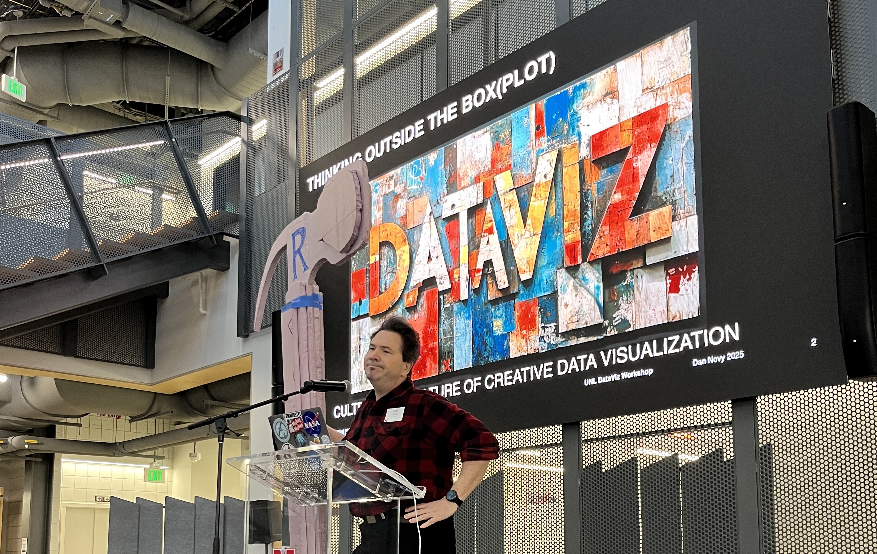
I’m just back from delivering the keynote talk at the Data Storytelling Workshop and Data Art Jam, which brought together a fascinating mix of creative thinkers, from scientists to journalists to artists. Hosted by Dan Novy at the Johnny Carson Center for Emerging Media Arts, this interdisciplinary event highlighted new ways of communicating through data, bridging art, technology, and storytelling. Here’s a look at the insights and projects from the other speakers at the event:
Dr. Laura Guertin’s Data Quilts
Dr. Laura Guertin from PennState Brandywine opened the event with her deeply personal and innovative approach to data storytelling. As a trained marine geologist, she had spent much of her career in STEM education. But it was an object from her grandmother—a Kenmore sewing machine—that set her on a new path. Laura began quilting and soon realized that quilts could tell stories, including those based on data. In 2018, she joined a team working on “coastal optimism,” an initiative that aimed to counter the often bleak narratives of environmental decline (for me this evoked a solutions journalism approach). Instead of focusing solely on doom and gloom, she highlighted solutions: open levees in Louisiana that balance storm protection with environmental exchange, and offshore Christmas tree pens used to reduce coastal erosion.
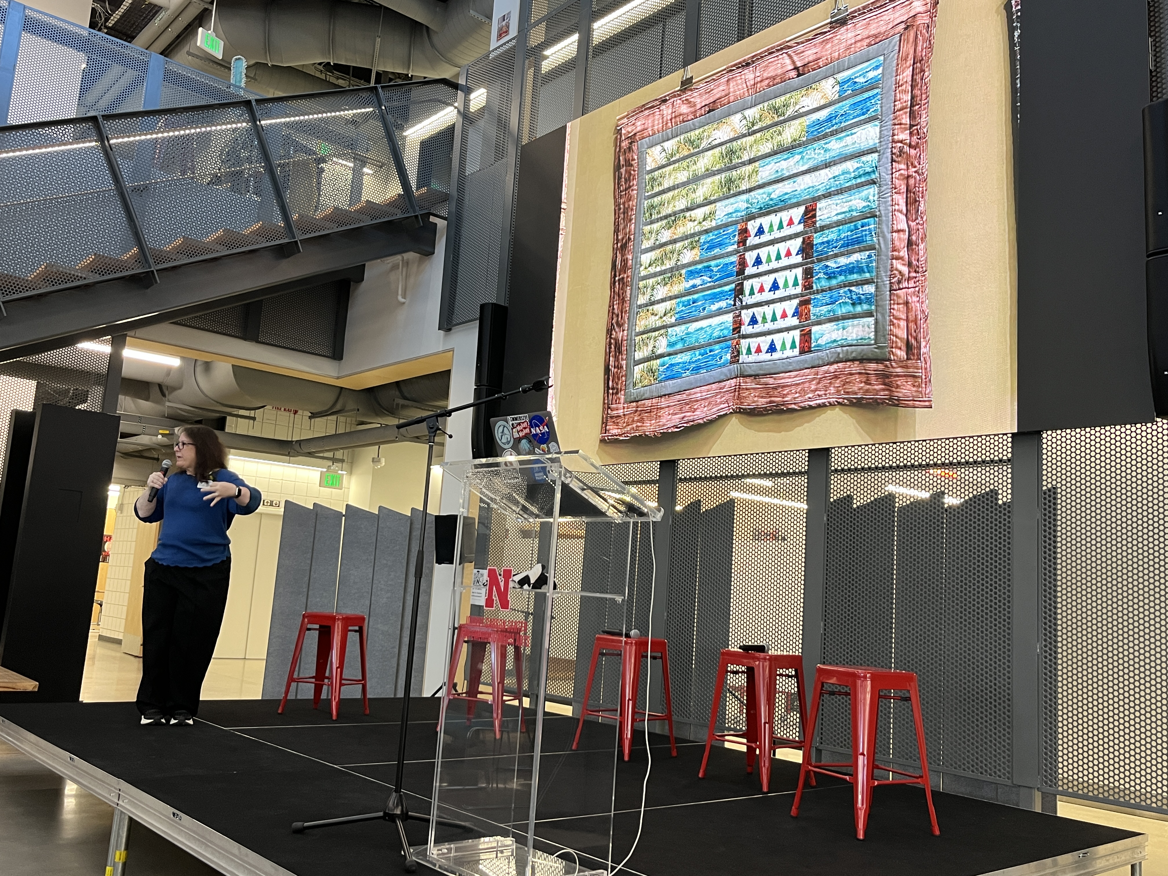
Inspired by these stories, Laura returned home and created “Stitching Hope for the Louisiana Coast,” her first data quilt. The response was overwhelming, and she began exploring more ways to translate climate data into fabric arts. This relates to now-popular trends like temperature scarves—knitted or stitched rows of fabric, each representing a day’s temperature—and expanded the concept to include themes like air quality and rainfall.
Her most recent work connected to a research expedition on the open ocean. Serving the role of education and outreach on the boat, Zoom interactions with kindergarteners about measuring cloud cover inspired a quilt about the related data they were producing on-board. She shared daily photos of the sky with the kids, and the kids collected their own data to compare. The quilt she later made when back on shore, using local South African fabrics, visually represented cloud cover with colorful trapezoids, connecting scientific observation to physical materials and local culture. Laura’s quilting projects demonstrate how creative approaches to data can evoke curiosity and make complex information more accessible to a wide variety of audiences. As she noted, quilts have a unique power to draw people in—they feel warm and inviting, not intimidating. Explore more of her work on Dr. Guertin’s website.
Matt Waite on Data Journalism with AI
Later, Matt Waite, a journalism professor at the University of Nebraska-Lincoln, took the stage with a compelling argument for using artificial intelligence in journalism—but only for the boring stuff. He described AI as “the dumbest intern you could have,” perfect for automating repetitive tasks while leaving the creative work to humans. During a recent sabbatical, Matt explored how generative AI could support data journalism. His project focused on using R to integrate with Google Gemini, automating the summarization of county-level data to create personalized, map-based visualizations. He emphasized how this could make journalism more efficient, particularly for local stories.
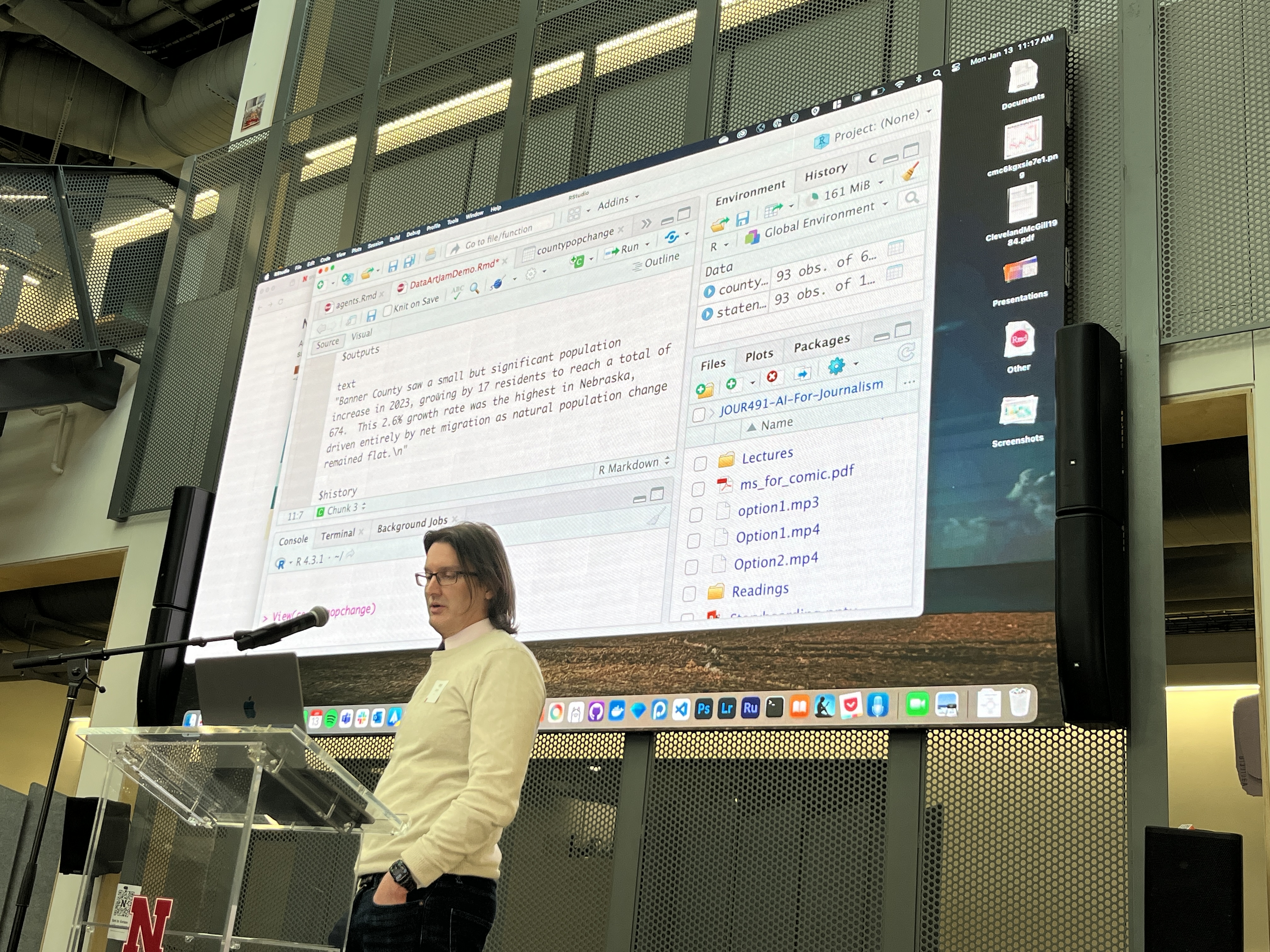
However, as he demonstrated, genAI isn’t foolproof. When he added a fact-checking bot to audit the summaries it produced, it caught errors, such as incorrectly describing a zero value as “no change.” Asking it to add “local context” to headlines introduced even more opportunities for inaccuracies. For Matt, these missteps underscored the importance of starting small with AI. Rather than aiming for big, transformative projects, he advocated for using AI to handle the mundane tasks that free up human journalists to focus on what truly matters: creativity and critical thinking.
Robert Twomey on Data and Art
The final presentation of the morning came from Robert Twomey, an artist and engineer whose work explores the intersection of data and art. Robert shared how his background in both science and painting informs his practice, with a focus on observation and representation. He drew inspiration from his MFA advisor, Natalie Jeremijenko, and projects like the “Suicide Box,” which used motion detection to document unquantified data on the Golden Gate Bridge. Robert pointed to how Jeremijenko’s work asks thought-provoking questions that are still core today: What counts as data? How can art challenge the ways we encounter and understand it?
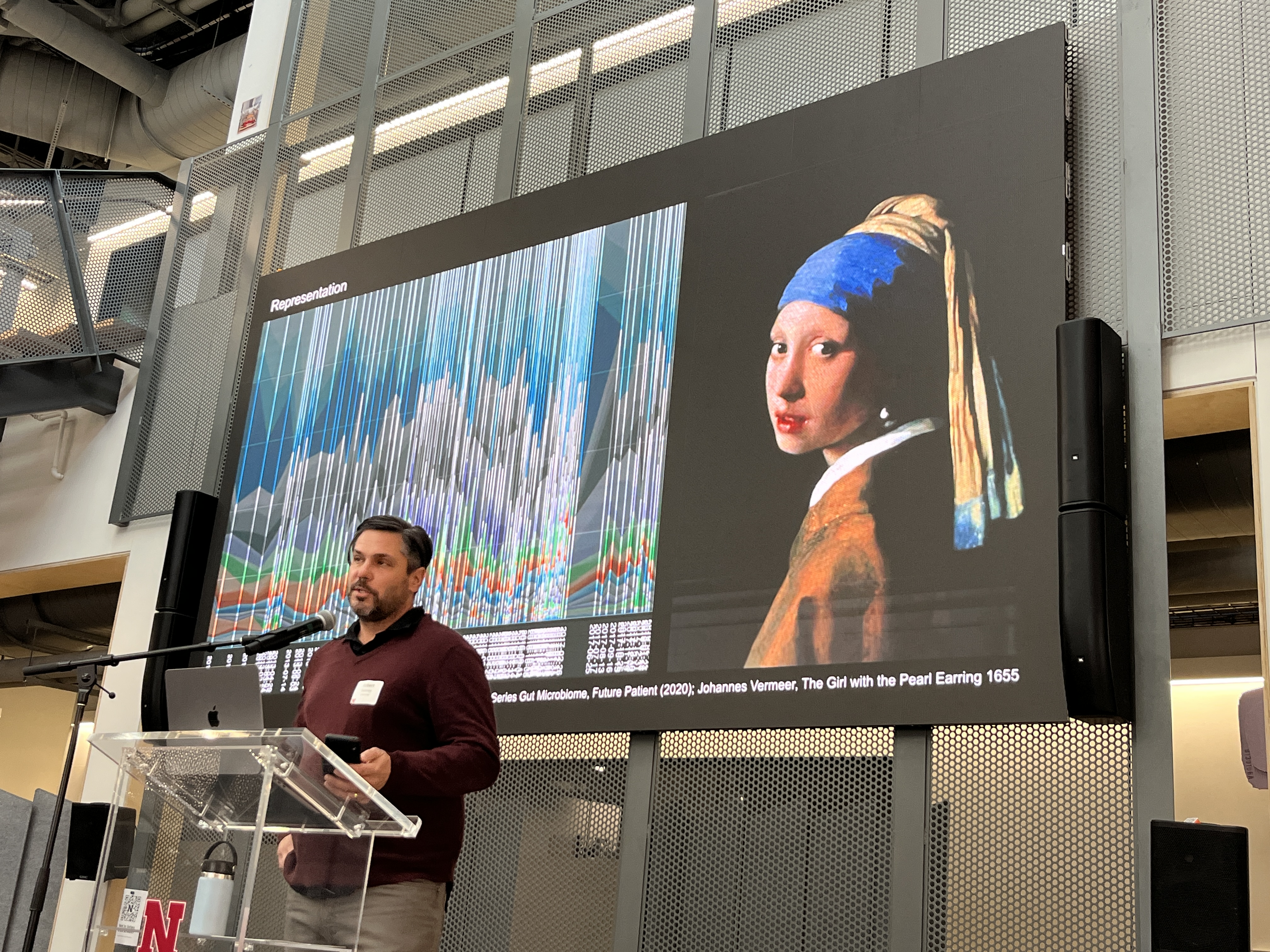
He showcased projects that ranged from data physicalizations to generative art. One example was Sabrina Raaf’s Translator II: Grower, which visualized CO₂ levels by “painting” them on a gallery wall. Another, Joel Ong’s Aeolian Traces, used human migration data to generate fan-driven wind in a physical installation. Robert’s own work included a chatbot he created in 2005 based on interactions with his grandmother, who had been diagnosed with Alzheimer’s. The chatbot became an interactive data portrait, offering a poignant exploration of memory and technology. In another project, Garbage Cubes, Robert compressed physical artifacts into sculptural representations of “irreversible data compression,” challenging traditional notions of how we store and interpret information.
Throughout his talk, Robert emphasized the role of artists as experts in making things experiential. He pondered genAI’s ability to have explanatory power at all.
My Own Take on “Data Beyond the Visual”
As the opener before these brilliant folks, I took the opportunity to challenge the audience to rethink how we engage with data in community settings. I laid some groundwork by focusing on how now-traditional data visualization methods, developed in fields like science and business, often fail to meet the needs of pro-social domains like museums, libraries, and grassroots activism. These settings require tools that prioritize participation, empowerment, and justice.
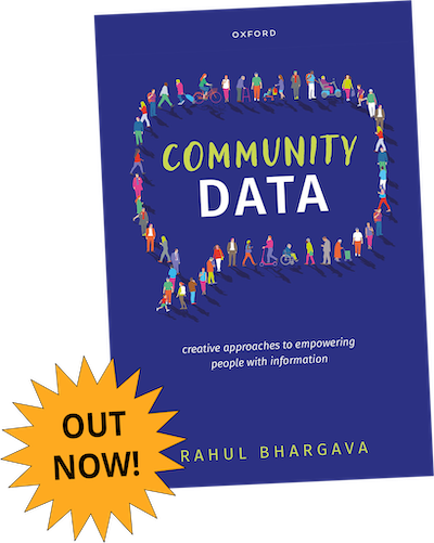
Pulling from my book, I highlighted examples like participatory data murals and civic data sculptures, to demonstrate how creative approaches can reflect data back to communities, fostering deeper connections and driving action. I also previewed work on Data Drums, a climate change sonification composed for a Brazilian drum troop, which is set to debut this spring (more to come on here soon).
Through evocative examples and practical insights, I urged the audience to go beyond default charts and graphs, activating the latent creative capacity within communities to make data work more inclusive, impactful, and joyful.
Those talks set the scene for a hands-on 2nd half of the day, where groups spent hours designing and building data sculptures with copious amounts of craft materials, large and small, that Novy had supplied. The open space made collaboration easy, and groups dove in with impressive energy to the new activity.
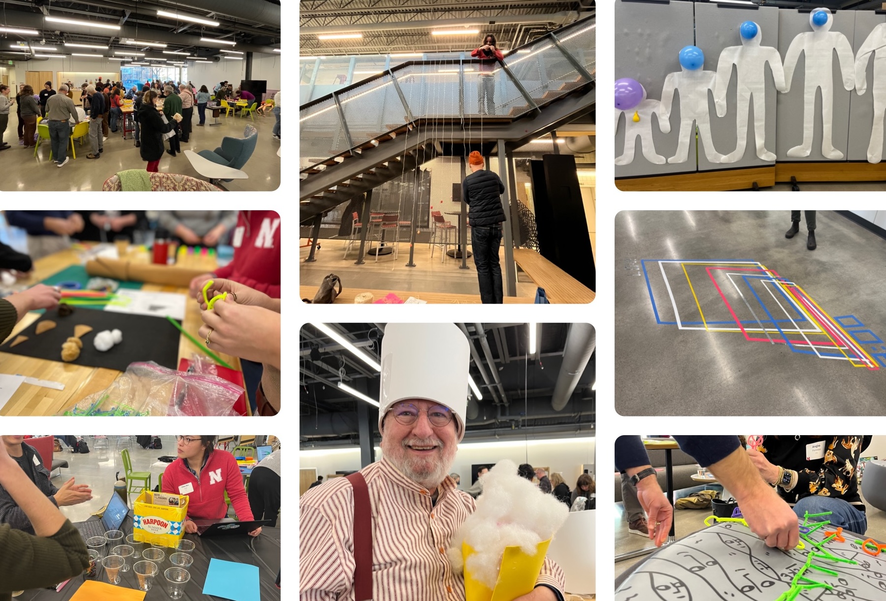
Overall, the Data Art Jam was a testament to the power of interdisciplinary collaboration. From quilts that tell stories of resilience, to AI tools that simplify journalism, to art that questions the very nature of data, the event showcased the endless possibilities for reimagining how we communicate information. It left attendees inspired to experiment, adapt, and push the boundaries of what data storytelling can achieve.
Note: this post was drafted from my personal notes into a narrative using genAI tools and then reviewed and editing by hand
