The latest Zelda game is being covered a lot more in Democrat-serving online news sites. That’s one of the first random tidbits I noticed in “On Our Own Terms”, a new tool built by Claire Pan and I as part of the Media Could project.
 Top terms from the week starting May 15th, 2023. I’ve highlighted the Zelda-related terms, which only show up on left-leaning sources.
There are more impactful details to be discovered in there, such as fact that Tucker Carlson’s dismissal from Fox News was covered in Republican-serving online news for longer than in Democrat-serving sites. However, this disparate coverage of Zelda is and intriguing thread to pull on in the future.
 Top terms from the week starting May 1st, 2023. I’ve highlighted Tucker Carlson’s name which only shows up on right-leaning sources. This is over a week after he was fired on April 24th.
How we Breakdown Media by Partisanship
We created “On Our Own Terms” to let researchers and news-junkies perform a high-level comparison of terms used in news headlines across a political breakdown of media. This breakdown is a bit complicated to explain, but stick with me as a I run you though it. We’ve build on a Twitter user panel created by my colleague David Lazer’s lab, where they associated half a million Twitter users with their voter registration records. Mining that network for links shared in tweets, they’ve produced ratios indicating the comparative sharing between registered Democrats and Republicans by domain name. We’ve narrowed these domains into US-published news sites, and put them into 3 buckets: domains shared more often by registered Democrats on Twitter, domains shared roughly equally by registered Republicans and registered Democrats on Twitter, and domains shared more often by registered Republicans on Twitter. Hopefully I didn’t lose you in the middle of that, because the end results is three buckers of news sources that we can talk about as left-leaning, right-leaning, and central. That’s a bit hand-wavy, because we’ve not actually rating the sources or their content themselves, but it sure is a lot easier to explain than the rest of the paragraph above.
The “On Our Own Terms” dashboard uses this political breakdown of US online news sources to show you top words in headlines on a week-by-week basis. Why? We have more than a decade of strong evidence about the trend towards polarization in news sources in the US (particularly on the right). In addition language analysis shows how politicians are increasingly using completely different language and terms in congress. Combine there and you can see how as a country we’re beginning to have very different parallel conversations, creating serious threats to shared consensus on reality and overall civic cohesion.
Why Show Top Terms?
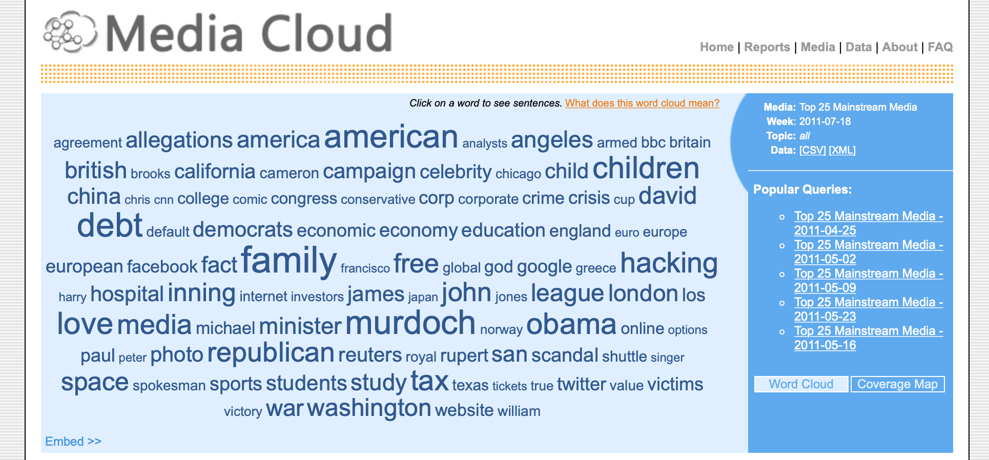
Almost 15 years ago the Media Cloud project began with one of the primary goals to map the broader media landscape. A word cloud of top terms was one of the first dashboards the team created (that predated my work on the project). We’re in the process of rebuilding right now, in collaboration with the Internet Archive’s Wayback Machine, so I wanted to honor and return to that history by building an updated version of that dashboard as a first step.
 The mediacloud.org homepage circa 2011, courtesy of a snapshot on the Internet Archive’s Wayback Machine.
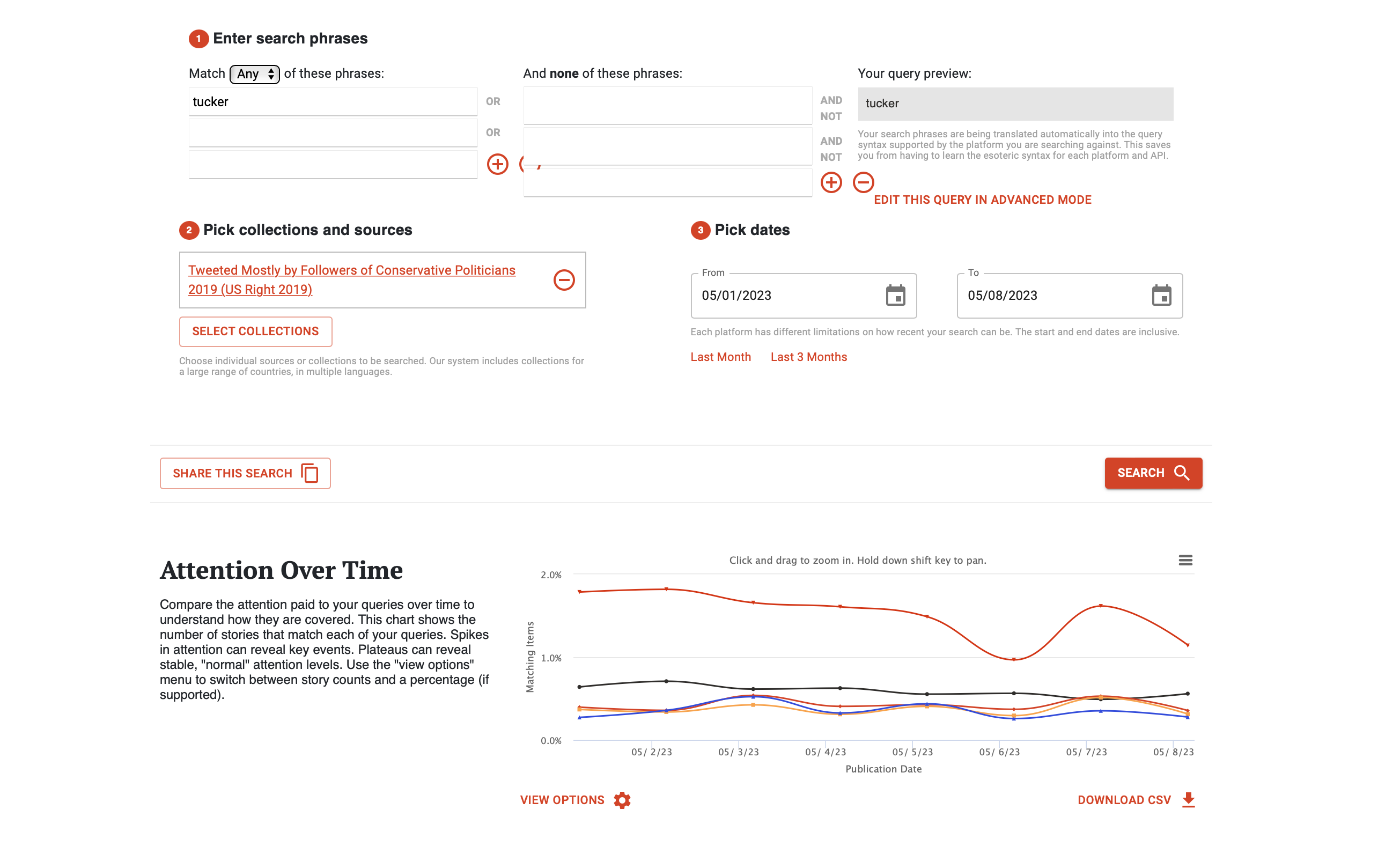
Looking at top terms in headlines can give informed news followers a quick summary of the events and people that are driving news, and sometimes even clues about the narratives. Of course, out of context terms don’t really explain what different stories are, so we’ve set it up so that clicking on a terms opens up a search in our online news archive for stories that have that term in their headline.
 An example of searching for the amount of stories mentioning “tucker” in the week starting May 1st, 2023 in the Media Cloud search tool
An Evolving Tool
Over the summer we will be expanding on this dashboard, giving you an alternate way to explore the news. As I mentioned, we’re still reconstructing this searchable online news archive, so there will be some hiccups and bugs. That said, give it a spin if you’re intrigued and we think it’ll will reveal some interesting threads to pull on, perhaps even more relevant for our lives and civic structures than who is resporting on the latest Zelda game. Just bookmark On Our Own Terms and it will update automatically every week. Want to help? You can check out the source code and historical data in our open-source code repository.


